MACD-Histogram
Search ChartSchool
Introduction
Developed by Thomas Aspray in 1986, the MACD-Histogram measures the
distance between MACD and its signal line (the 9-day EMA of MACD). Like
MACD, the MACD-Histogram is also an oscillator that fluctuates above and
below the zero line. Aspray developed the MACD-Histogram to anticipate
signal line crossovers in MACD. Because MACD uses moving averages and
moving averages lag price, signal line crossovers can come late and
affect the reward-to-risk ratio of a trade. Bullish or bearish
divergences in the MACD-Histogram can alert chartists to an imminent
signal line crossover in MACD. See our ChartSchool article for more on MACD.
Calculation
MACD: (12-day EMA - 26-day EMA)

Signal Line: 9-day EMA of MACD

MACD Histogram: MACD - Signal Line
Standard MACD is the 12-day Exponential Moving Average (EMA) less the 26-day EMA. Closing prices are used to form the moving averages so MACD. A 9-day EMA of MACD is plotted along side to act as a signal line to identify turns in the indicator. The MACD-Histogram represents the difference between MACD and its 9-day EMA, the signal line. The histogram is positive when MACD is above its 9-day EMA and negative when MACD is below its 9-day EMA.

Four Steps Removed
The MACD-Histogram is an indicator of an indicator. In fact, MACD is
also an indicator of an indicator. This means that the MACD-Histogram is
four steps removed from the price of the underlying security. In other
words, it is the fourth derivative of price.
- First derivative: 12-day EMA and 26-day EMA
- Second derivative: MACD (12-day EMA less the 26-day EMA)
- Third derivative: MACD signal line (9-day EMA of MACD)
- Fourth derivative: MACD-Histogram (MACD less MACD signal line)
Interpretation
As with MACD, the MACD-Histogram is also designed to identify
convergence, divergence and crossovers. The MACD-Histogram, however, is
measuring the distance between MACD and its signal line. The histogram
is positive when MACD is above its signal line. Positive values increase
as MACD diverges further from its signal line (to the upside). Positive
values decrease as MACD and its signal line converge. The
MACD-Histogram crosses the zero line as MACD crosses below its signal
line. The indicator is negative when MACD is below its signal line.
Negative values increase as MACD diverges further from its signal line
(to the downside). Conversely, negative values decrease as MACD
converges on its signal line.

Chart 1 shows Darden Restaurants (DRI) with MACD and the MACD-Histogram. A bearish signal line crossover occurred in late September and this turned the MACD-Histogram negative. A bullish signal line crossover occurred in early December and this turned the MACD-Histogram positive the rest of the month. There was a period of divergence as MACD moved further from its signal line (green line) and a period of convergence as MACD moved closer to its signal line (red line).
Chart 1 shows Darden Restaurants (DRI) with MACD and the MACD-Histogram. A bearish signal line crossover occurred in late September and this turned the MACD-Histogram negative. A bullish signal line crossover occurred in early December and this turned the MACD-Histogram positive the rest of the month. There was a period of divergence as MACD moved further from its signal line (green line) and a period of convergence as MACD moved closer to its signal line (red line).
Peak-Trough Divergence
The MACD-Histogram anticipates signal line crossovers in MACD by forming bullish and bearish divergences.
These divergences signal that MACD is converging on its signal line and
could be ripe for a cross. There are two types of divergences:
peak-trough and slant. A peak-trough divergence forms with two peaks or
two troughs in the MACD-Histogram. A peak-trough bullish divergence
forms when MACD forges a lower low and the MACD-Histogram forges a
higher low. Well-defined troughs are important to the robustness of a
peak-trough divergence. Chart 2 shows Caterpillar with a bullish
divergence in the MACD-Histogram. Notice that MACD moved to a lower low
in June-July, but the MACD-Histogram formed a higher low (trough). There
are two distinct troughs. This bullish divergence foreshadowed the
bullish signal line crossover in mid-July and a big rally.

Chart 3 shows Aeropostale (ARO) with a bearish divergence in August-September 2009. MACD moved to a new high in September, but the MACD-Histogram formed a lower high. Notice that there are two definitive peaks (higher) with a dip in between on the MACD-Histogram (red line). The subsequent bearish signal line crossover foreshadowed a sharp decline in the stock.

Chart 3 shows Aeropostale (ARO) with a bearish divergence in August-September 2009. MACD moved to a new high in September, but the MACD-Histogram formed a lower high. Notice that there are two definitive peaks (higher) with a dip in between on the MACD-Histogram (red line). The subsequent bearish signal line crossover foreshadowed a sharp decline in the stock.
Slant Divergence
As its name implies, slant divergences form without well-defined peaks
or troughs. Instead of two reaction highs, there is simply a slant lower
as the MACD-Histogram moves towards the zero line. This slant towards
the zero line reflects a convergence between MACD and its signal line.
In other words, they are getting closer to each other. Momentum shows
strength when MACD is moving away from its signal line and the
MACD-Histogram expands. Momentum weakens as MACD moves closer to its
signal line and the MACD-Histogram contracts. Contracting MACD-Histogram
is the first step towards a signal line crossover.
Chart 4 shows Boeing with a classic slant divergence in the MACD-Histogram. MACD moved sharply lower after the bearish signal line crossover in June 2009. MACD moved to a new low in mid-July, but the MACD-Histogram held well above its prior low. In fact, the MACD-Histogram bottomed towards the end of June and formed a bullish slant divergence. The thick red lines show the distance between MACD and its signal line. It is sometimes hard to gauge distance on the chart so these lines highlight the difference between 26-June and 8-July. This slant divergence foreshadowed the bullish signal line crossover in mid-July and a sharp advance in the stock.

Chart 5 shows Disney (DIS) with a bearish slant divergence in May 2008. Notice how MACD continued to a new high on 16-May, but the MACD-Histogram peaked on 8-May and formed a slant divergence. The advance in MACD was losing momentum and the indicator moved below its signal line to foreshadow a sharp decline in the stock. This chart also shows a nice bullish divergence in March-April.

Chart 4 shows Boeing with a classic slant divergence in the MACD-Histogram. MACD moved sharply lower after the bearish signal line crossover in June 2009. MACD moved to a new low in mid-July, but the MACD-Histogram held well above its prior low. In fact, the MACD-Histogram bottomed towards the end of June and formed a bullish slant divergence. The thick red lines show the distance between MACD and its signal line. It is sometimes hard to gauge distance on the chart so these lines highlight the difference between 26-June and 8-July. This slant divergence foreshadowed the bullish signal line crossover in mid-July and a sharp advance in the stock.
Chart 5 shows Disney (DIS) with a bearish slant divergence in May 2008. Notice how MACD continued to a new high on 16-May, but the MACD-Histogram peaked on 8-May and formed a slant divergence. The advance in MACD was losing momentum and the indicator moved below its signal line to foreshadow a sharp decline in the stock. This chart also shows a nice bullish divergence in March-April.
Conclusions
The MACD-Histogram is an indicator designed to predict signal line
crossovers in MACD. By extension, it is designed as an early warning
system for these signal line crossovers, which are the most frequent of
MACD signals. Divergences in the MACD-Histogram can be used to filter
signal line crossovers, which will reduce the number of signals. Even
with a filter, the robustness of MACD-Histogram divergences is still an
issue. Short and shallow divergences are much more frequent than long
and large divergences. In other words, divergences that develop over a
few days with shallow movements are generally less robust than
divergences that develop over a few weeks with more pronounced
movements. The signal line crossover provides the ultimate confirmation,
but aggressive traders may try to improve the reward-to-risk ratio by
making their move just before the crossover. This is when the
MACD-Histogram is as close to the zero line as it can be without
actually making a cross, usually between -.20 and +.20.
Using with SharpCharts
MACD comes with the MACD-Histogram, but the MACD-Histogram can be shown
as a stand-alone indicator. This makes it much easier to identify
divergences and crossovers. The MACD-Histogram can be set as an
indicator above, below or behind the price plot of the underlying
security. The histogram covers a lot of chart space so it is often best
to place it above or below the main window. It is possible to show MACD
without the histogram in the main window. Choose MACD as an indicator
and change the signal line number from 9 to 1 (9,26,1). This will remove
the signal line and the histogram. The signal line can be added
separately by clicking the advanced indicator options and adding a 9-day
EMA.
Click here for a live chart featuring the MACD-Histogram.


Click here for a live chart featuring the MACD-Histogram.
Suggested Scans
MACD-Histogram Turns Positive
First, this scan only considers stocks trading above their 200-day
moving average, which implies an uptrend overall. Second, the
MACD-Histogram moves from negative territory to positive territory.
Also, notice that MACD is required to be negative to ensure this upturn
occurs after a pullback. This scan is just meant as a starter for
further refinement.
[type = stock] AND [country = US]
AND [Daily SMA(20,Daily Volume) > 40000]
AND [Daily SMA(60,Daily Close) > 20]

AND [Daily Close > Daily SMA(200,Daily Close)]
AND [Yesterday's Daily MACD Hist(12,26,9,Daily Close) < 0]
AND [Daily MACD Hist(12,26,9,Daily Close) > 0]
AND [Daily MACD Line(12,26,9,Daily Close) < 0]
MACD-Histogram Turns Negative
First, this scan only considers stocks trading below their 200-day
moving average, which implies a downtrend overall. Second, the
MACD-Histogram moves from positive territory to negative territory. Also
notice that MACD is required to be positive to ensure this downturn
occurs after a bounce. This scan is just meant as a starter for further
refinement.
[type = stock] AND [country = US]
AND [Daily SMA(20,Daily Volume) > 40000]
AND [Daily SMA(60,Daily Close) > 20]

AND [Daily Close < Daily SMA(200,Daily Close)]
AND [Yesterday's Daily MACD Hist(12,26,9,Daily Close) > 0]
AND [Daily MACD Hist(12,26,9,Daily Close) < 0]
AND [Daily MACD Line(12,26,9,Daily Close) > 0]
For more details on the syntax to use for MACD-Histogram scans, please see our Scanning Indicator Reference in the Support Center.
A Quicker Trade Signal Using MACD’s Histogram
May 15, 2014 9:03 am +06:00

Talking Points:
What Does the Histogram Represent? Learn Forex: MACD’s Histogram Construction 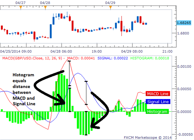
(Created from FXCM’s Marketscope 2.0)
The chart above shows what the Histogram represents. The first
label shows how the MACD is higher than the Signal line. This creates a
positive green bar that has a height equal to the difference of the two
lines. The second example the MACD is below the Signal line. This
creates a negative green bar that has a height equal to the difference
between the two lines. We can also see that when the Blue and Red lines
cross, the histogram flips from one side to the other.
How to Enter Based On the Histogram So how can we read the histogram to generate trade signals? We first want to track the histogram as it moves away from the zero line, in other words, track it as its bars grow larger. The actual signal comes when the histogram no longer gets larger and produces a smaller bar. Once the histogram prints a smaller bar, we look to trade in the direction of the histogram’s decline. We can see an example of this in the chart below: Learn Forex: MACD Histogram Entry Logic 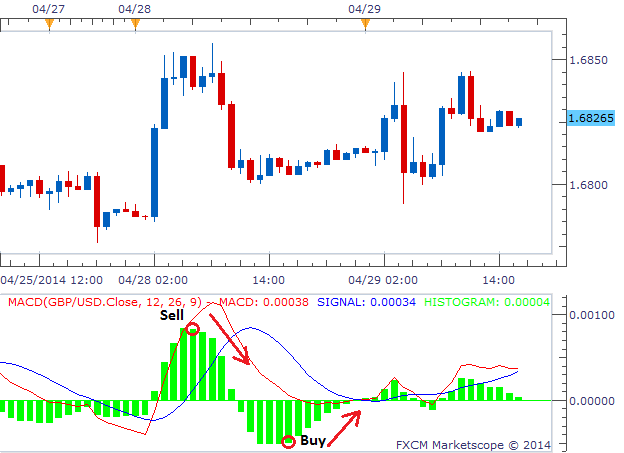 The Sell signal on the left was created by four growing bars in a
row followed by a fifth bar that closed smaller. Five bars later, we see
the MACD line crossing below the Signal line which is a traditional
MACD signal. This later signal would have missed a majority of the move
that the Histogram signal would have caught. Therefore, using the
histogram as a signal can earn us a greater number of pips.
The Sell signal on the left was created by four growing bars in a
row followed by a fifth bar that closed smaller. Five bars later, we see
the MACD line crossing below the Signal line which is a traditional
MACD signal. This later signal would have missed a majority of the move
that the Histogram signal would have caught. Therefore, using the
histogram as a signal can earn us a greater number of pips.
The Buy signal on the right is a similar story. We saw four bars growing consecutively until a 5th bar was created that equaled the 4th. We want to wait until a bar is smaller, so the trigger would have been presented after the 6th bar closed. This buy trade came several bars before the MACD/Signal cross and gave us a better entry as well. Once we are in the trade, we can use sound Money Management to close out the trade appropriately. Good trading! ---Written by Rob Pasche Interested in learning more about Forex trading and strategy development? Signup for a series of free guides, to help you get up to speed on a variety of trading topics! Register HERE. |
Hello everyone, Are you into trading or just wish to give it a try, please becareful on the platform you choose to invest on and the manager you choose to manage your account because that’s where failure starts from be wise. After reading so much comment i had to give trading tips a try, I have to come to the conclusion that binary options pays massively but the masses has refused to show us the right way to earn That’s why I have to give trading tips the accolades because they have been so helpful to traders . For a free masterclass strategy kindly contact (paytondyian699@gmail.com) for a free masterclass strategy. He'll give you a free tutors on how you can earn and recover your losses in trading for free..or Whatsapp +1 562 384 7738
ReplyDelete